Hello!
My name is Karli, and I am a new member to the Farmigo team. I will be bringing you tips of the week to update you on our new and improved features.
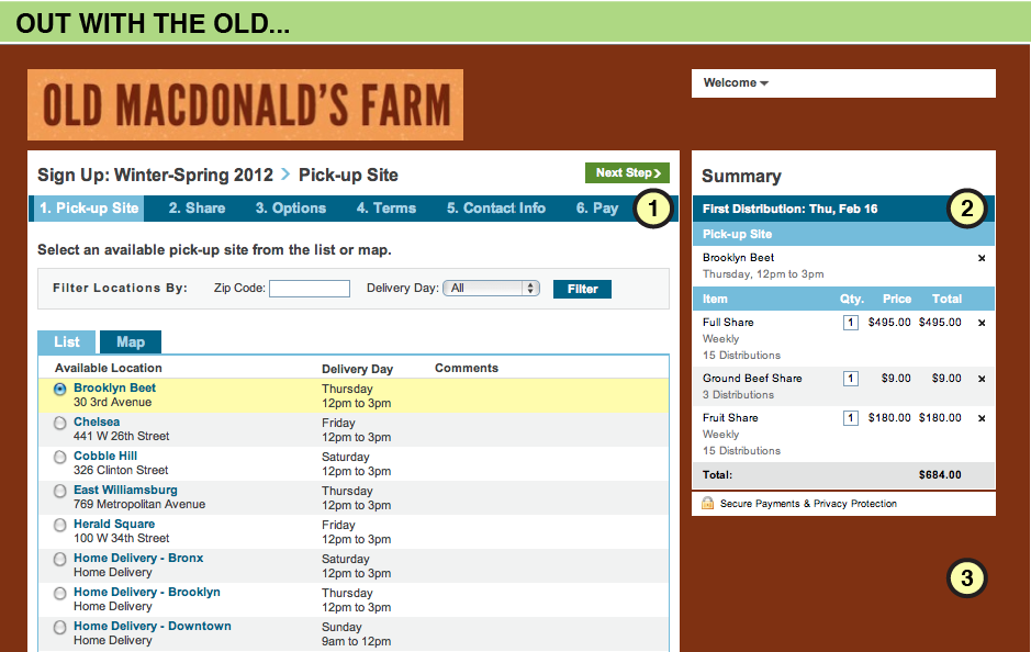
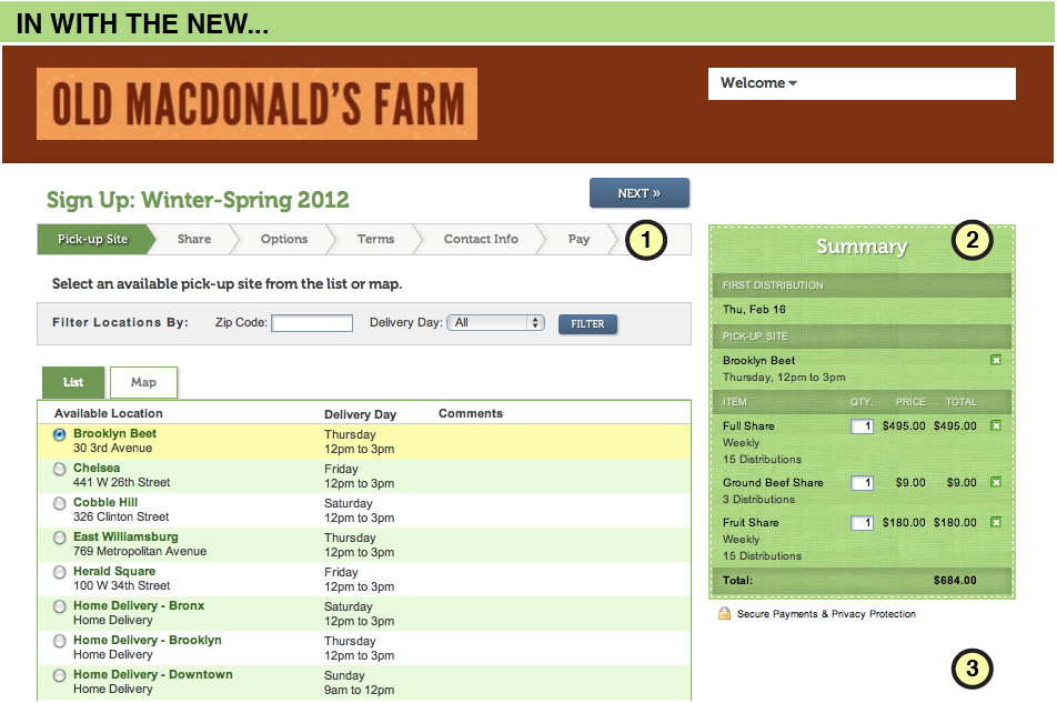
This week, I want to introduce you to our enhanced user sign-up experience. We have received feedback from your CSA members that some aspects of the sign-up process is unclear. We also received feedback from you, our farmers, that you would like the sign-up design to be more inline with your website. We've been listening and have made an effort to redesign the sign-up interface to make it a more attractive and enticing experience for users. Below are screenshots of the old and new interfaces so you can get a look at the changes we made. We hope you like it!
My name is Karli, and I am a new member to the Farmigo team. I will be bringing you tips of the week to update you on our new and improved features.
This week, I want to introduce you to our enhanced user sign-up experience. We have received feedback from your CSA members that some aspects of the sign-up process is unclear. We also received feedback from you, our farmers, that you would like the sign-up design to be more inline with your website. We've been listening and have made an effort to redesign the sign-up interface to make it a more attractive and enticing experience for users. Below are screenshots of the old and new interfaces so you can get a look at the changes we made. We hope you like it!
Let me introduce you to a few of the improved features:
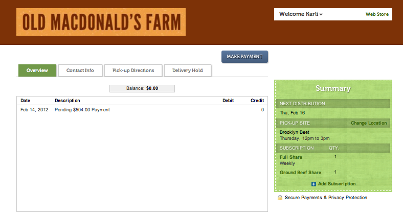
- New sign-up process navigation bar displays the steps as a forward moving sequence so members better understand the process
- New summary box displays distribution and delivery details more effectively, minimizing errors in customer orders
- The white background creates a more attractive, simpler environment that customers say makes the information clearer
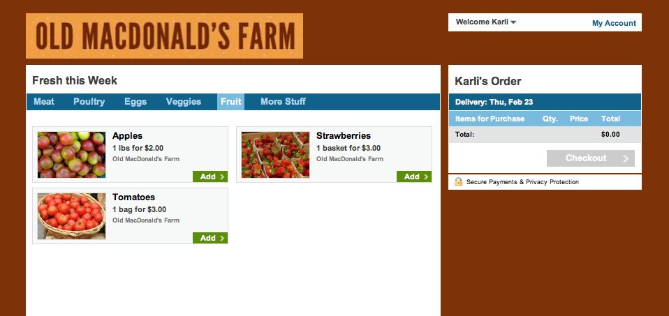
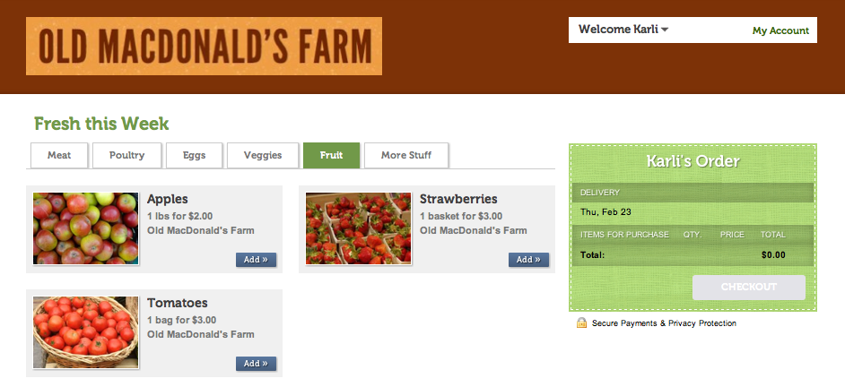
We are also introducing a new web store and member account sign in interface. Below are screen shots of the old and new looks.
Old Web Store
New Web Store
Old Member Account
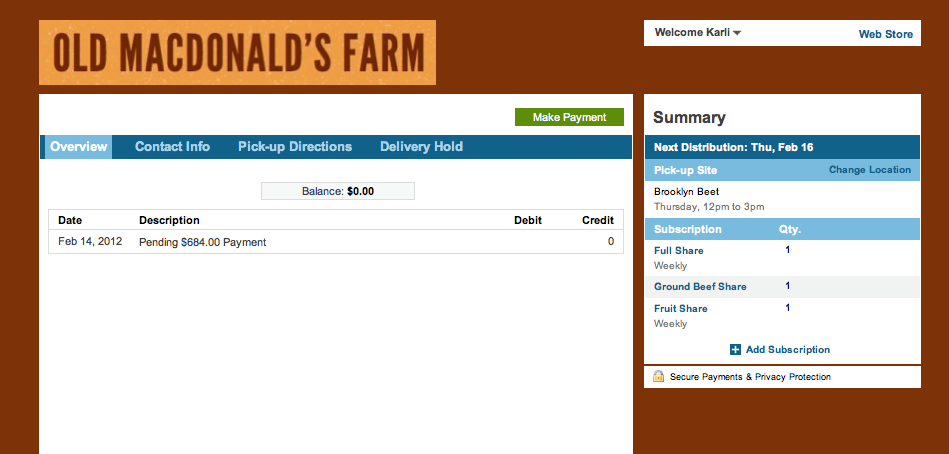
New Member Account
Now that you've seen the changes we've made, consider taking some steps to enhance your own user sign-up experience!
- Flaunt your art skills - If you have changed your logo since you started using Farmigo, let us know and we will help you change it. As a reminder, the logo should be 442 x 73 pixels.
- Entice your customers with some juicy photographs - We are getting feedback from your members that they would like to see better pictures of your shares. If you find you have any free time, why not take a minute to change your share photograph? If you want to show more than one picture of your share, consider adding a link to a web album under the description for the item in the dashboard. It's what I like to call the Food Network affect - the more you see it, the more you want to eat it!